tfs-demos
CSS Refresher
Introducing CSS
What is CSS?
You may have noticed that pure HTML pages look a bit…plain.
When you use a word processor program/application such as Microsoft Word or Google Docs, you can select a block of text and give it a type, identifying a semantic meaning for the text, such as describing it as a heading.
You can see similarities with HTML tags.
Identifying the semantics also gives the block of text a corresponding visual style - there are a set of predefined styles that are used to make a document look consistent.
You will have seen the default styles for HTML elements. When we specify text as being a paragraph (<p>…</p>) or heading (<h1>…</h1>, <h2>…</h2>, etc), the browser uses some appropriate default styles.
Identifying the semantics of a document makes it possible to change the style of all occurrences of each block type, rather than having to manually change them individually.
We can change the default styles of an HTML web page with Cascading Style Sheets, or CSS.
What does CSS look like?
We can use CSS to style all occurrences of an HTML element.
In the following example, we will make all paragraph (<p>) elements red.
If you had the following HTML:
<p>I live on planet Earth</p>
CSS styles would be defined in the following format:
p {
    color: red;
    font-weight: bold;
    font-family: sans-serif;
    font-size: 30px;
}
And the result would be:
I live on planet Earth
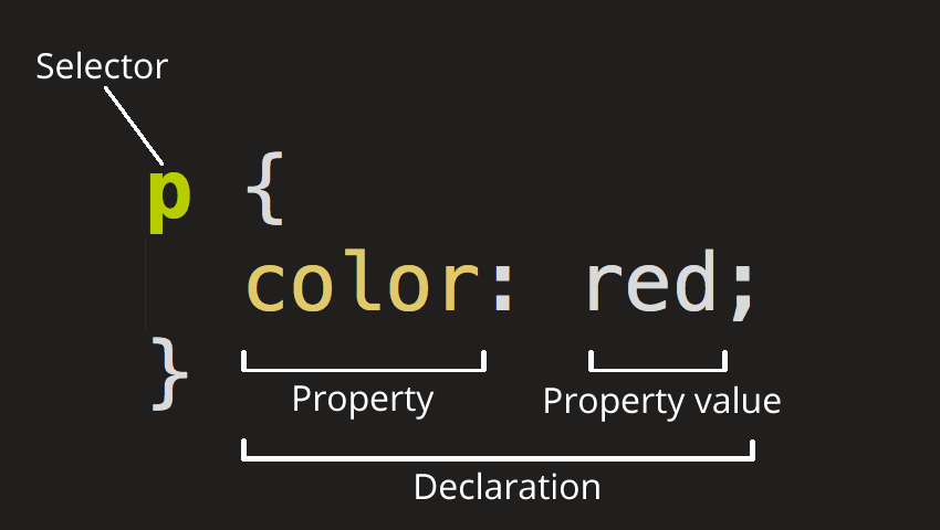
Here’s a guide to the terminology we’ll be using to describe this:
Source: https://developer.mozilla.org/en-US/docs/Learn/Getting_started_with_the_web/CSS_basics
The CSS above represents a style definition applied to an HTML element:
- The selector is the text before the curly brackets, and references the HTML element that the style should apply to, in this case all
<p>paragraph tags. - The property is the part of the formatting is being specified (
colorandfont-weight) - The value represents how is it styled (
redandbold).
How do we add CSS to our HTML?
There are three methods to add CSS to our HTML. The first two are here just for reference, but it’s the third method you should use, for the reasons given below.
Inline styles
You could add CSS directly to your HTML elements:
<p style="color: #f90">Here is some orange text</p>
<p style="color: #f90">And some more orange text</p>
The main reason to avoid this method is that you need to repeat your styles every time you want to use them. Instead, we want to separate our content from its presentation.
In-page styles
You could add a <style> tag to the <head> of the page:
<!doctype html>
<html>
    <head>
        <meta charset="utf-8" />
        <title>Earth</title>
        <style>
            p {
                color: #f90;
            }
        </style>
    </head>
    <body>
        <p>Here is some orange text</p>
        <p>And some more orange text</p>
    </body>
</html>
This is an improvement over the first method in that the styles are separated from the content, but it doesn’t help if we wanted our styles to be applied across several pages, we would still need to repeat them in every page.
.css file
The recommended method to store CSS is to keep styles in a separate file. This allows us to separate our content from our styles, and has an added advantage that we can use the same CSS file across multiple pages.
HTML file
<!doctype html>
<html>
    <head>
        <meta charset="utf-8" />
        <title>Earth</title>
        <link rel="stylesheet" href="style.css" />
    </head>
    <body>
        <p>Here is some orange text</p>
        <p>And some more orange text</p>
    </body>
</html>
CSS file
p {
    color: #f90;
}
Exercise - CSS
We’re going to create a new HTML page, and then apply some styles with CSS.
-
Create a folder for CSS experiments and create an
index.htmlfile. Open it in an editor a so we can add some links to the new pages we’ll be creating. -
In your HTML add the following content:
<h2>CSS Exercises</h2> <ul> <li> <a href="./earth.html">Earth</a> </li> </ul> -
Create a new file, and call it earth.html
Note that this is all lowercase, with no spaces. This is where we’ll save all our exercises.
-
In this folder, create a new CSS file: earth.css - note the file extension is different!
-
In the new HTML file, copy and paste the following content:
<!doctype html>
<html>
    <head>
        <meta charset="utf-8" />
        <title>
            Earth
        </title>
        <link rel="stylesheet" href="earth.css" />
    </head>
    <body>
        <a href="./index.html">Back to the home page</a>

        <h1>I live on planet Earth</h1>

        <p>
            There are <em>many</em> reasons why
            <a href="https://en.wikipedia.org/wiki/Earth">Earth</a>
            is my <strong>favourite</strong> planet:
        </p>

        <ul>
            <li>Beautiful sunsets</li>
            <li>Rainforests and coral reefs</li>
            <li>I get to build websites</li>
        </ul>

        <img src="https://upload.wikimedia.org/wikipedia/commons/9/97/The_Earth_seen_from_Apollo_17.jpg" alt="A picture of the Earth" />

    </body>
</html>
Note in the <head> just after the <meta> and <title> we have added the following new tag:
<link rel="stylesheet" href="earth.css" />
This tells your HTML document that there is a stylesheet in the same directory as the HTML file.
- Open the CSS file and start writing styles for the HTML elements you have just created.
Open the HTML page in a new browser tab so you can easily refresh every time you make an update.
For example, to style the <h1> element blue:
h1 {
        color: blue;
}
To make the paragraphs bold and in a different font:
  p {
        color: red;
        font-weight: bold;
        font-family: sans-serif;
        font-size: 20px;
  }
To restrict the image size you could set its width to be based on the browser width, for example:
img {
        max-width: 50%;
}
To style a link:
a {
        color: green;
}
Note that this doesn’t change how the link looks when you hover over it with a mouse - we’ll see how to do this shortly.
Try experimenting - adding some more HTML elements (e.g. <h2>, <strong> etc), and some styles for each new element.
Change colours, change font sizes, etc.
If you get stuck you can look at the example answer:
class
The example above will style every top level heading (<h1>), paragraph (<p>) or image (<img>) in a web page.
Sometimes this is useful, but sometimes we want to style tags differently.
The way to do this is to use a class.
A class lets you identify specific HTML elements in the page - so you can style only some of them rather than all of them.
A class is added to the HTML, and then it can be styled by CSS.
Let’s say in the following HTML we wanted to only make the first paragraph red:
<p>
    I live on planet Earth
</p>

<p>
    It is the best of all the planets.
</p>
The CSS we have seen so far would style all paragraphs:
p {
    color: red;
}
In the HTML above, we can add a class to each paragraph so we can identify them:
<p class="introduction">
    I live on planet Earth
</p>

<p>
    It is the best of all the planets.
</p>
By default, just adding a class makes no difference to the style, so this first paragraph would still appear like all other <p> text.
But if we wanted it to be a different colour we could now select it using its class, but adding a dot followed by the class name:
.introduction {
    color: red;
}
And now the result would be:
I live on planet Earth
It is the best of all the planets.
The class name can be anything, you just have to think of something descriptive and meaningful. In the example above, introduction makes sense, blah would make less sense.
You can specify as many classes as you like, and you can use multiple classes on each element as long as you separate them by spaces. You’ll see an example of this shortly.
Exercise
- create a new HTML file - earth-facts.html
- create a new CSS file - earth-facts.css
- In the new HTML file, copy and paste the following content:
<!doctype html>
<html>
    <head>
        <meta charset="utf-8" />
        <title>
            Earth facts
        </title>
        <link rel="stylesheet" href="earth-facts.css" />
    </head>
    <body>
        <a href="./index.html">Back to the home page</a>

        <h1>Earth facts</h1>

        <ul>
            <li>Average distance from sun: <em class="fact">150,000,000 km</em></li>
            <li>Age: <em class="fact incredible">4,500,000,000 years</em></li>
            <li>Circumference: <em class="fact">40,000 km</em></li>
        </ul>
    </body>
</html>
- Set up some default styles in the the CSS file:
    h1 {
        color: blue;
    }

    li {
        font-size: 18px;
    }

    a {
        color: green;
    }
Check this new page in a web browser to make sure these styles are working.
- Now we want to add styles for the facts:
    .fact {
        color: red;
    }
- Notice the second fact has two classes separated by a space.
This means we can add extra styles just for this one fact:
    .incredible {
        font-weight: bold;
        font-size: 30px;
    }
- Try experimenting - adding some more HTML elements, add multiple classes on some of these tags, and some styles for each new class.
If you get stuck you can look at the example answer:
More CSS selectors
There’s a lot more to learn about CSS, you will pick this up as we proceed.
Here are a few more details that will be useful.
Styling links using a pseudo-selector
There are special ‘pseudo-selectors’ that can be used to style special states of elements.
The two that you are most likely to use relate to links:
-
Style an element when a user’s mouse is hovering over it (
:hover)a:hover { color: orange; } -
Style visited links differently (
:visited)a:visited { color: purple; }
This is how this would appear:
You can create examples of these later.
Descendant selectors
Descendant selectors are used to styles elements that are a descendent of another element.
For example, if we had the following HTML:
<p class="earth">
    This is the planet <em>Earth</em>
</p>

<p class="mars">
    This is the planet <em>Mars</em>
</p>
If we wanted to style only the <em> elements that are inside the element with a class of .earth we would use:
.earth em {
    color: green;
}

.mars em {
    color: orange;
}
Result:
This is the planet Earth
This is the planet Mars
You can create examples of these later.
Code indenting and information hierarchy
When we look at HTML, we see that usually it is written with indentation.
In comparison, when we write CSS it is all left-aligned.
HTML indenting
Why do we indent our HTML?
It’s to show the hierarchy of our information. The indents demonstrate the structure of the HTML elements - which content is contained within other content.
<!doctype html>
<html>
    <body>
        <ul>
            <li>Circumference: <em class="fact">40,000 km</em></li>
        </ul>
    </body>
</html>
In the example above, the (<em>…</em>) planet details are within a list item (<li>…</li>), which is within an unordered list (<ul>…</ul>) which is within the body of the page (<body>…</body>) which is within the ‘root’ html element (<html>…</html>).
Each of these defines an element that contains other elements.
- html
- body
- unordered list
- list item
- em
CSS indenting
Each of these elements can be styled with a simple CSS selector, regardless of where they sit in the HTML content hierarchy.
This is what we were doing earlier when we were using CSS.
This is why CSS isn’t indented, it doesn’t use the same hierarchy.
em {
    color: red;
}
Comments
Comments are a way to add notes to your code.
They are ignored by the web browser but they are useful for you to add structure to your code, and notes to explain how something works.
HTML comments
To add a comment in HTML use the following syntax:
<!doctype html>
<html>
    <body>
        <!-- The following facts were taken from Wikipedia -->
        <ul>
            <li>Earth's circumference: <em class="fact">40,000 km</em></li>
        </ul>
    </body>
</html>
CSS comments
To add a comment in CSS use the following syntax:
/* Style the planetary facts */
.fact {
    color: green;
}
Web browsers
Web browsers let us go ‘behind-the-scenes’ to see how they process web pages.
Firefox is a good example. If you right-click on any element and choose “inspect element”, Firefox will open up a ‘developer panel’ and show the attributes of any element.
It will even let to change it!
You can also do this in Microsoft Edge, Google Chrome and Safari. Firefox is a good choice for the open web, and to help protect your online privacy.
Note: If you are a Safari user you may need to do the following:
If you don’t see the Develop menu in the menu bar, choose Safari > Preferences, click Advanced, then select “Show Develop menu in menu bar”.
Inspecting our websites
Open your web page in a browser.
Right-click on the page and choose “inspect” or “inspect element” - note that it may be labelled something differently if you use a different browser.
A new panel will pop up at the bottom of the screen. Have a look around it.
Inspect the elements and the styles that are being used. You should recognise the HTML and CSS that you have just written.
-
Try changing some of the HTML through the inspector (double-click or right-click on it).
-
Try changing some of the CSS. For example, try adding the following styles to one of the classes:
border: 5px solid fuchsia; font-size: 40px; -
Refresh the page and see what happens to the changes you just made through the inspector.
In the right-hand panel, look for the ‘layout’ tab. See how it gives you dimensions for margin, border, padding and size.
When you click on different elements in the page, or right-click and “inspect” elements on the page, you’ll see the margin, border, padding and size indicated.
This demonstrates that all elements can have styles that we can create and modify.
Inspecting other websites
Now do this on another website, for example BBC News
Inspect the page, edit some of the CSS and HTML, refresh the page.
Note that you can see the HTML and CSS for any website.
More CSS properties and values
There are many more CSS properties and values than you have seen so far. You will pick up more in the following exercises, but here is an introduction to some handy ones.
Units
When you specify the size of something, you need to define which units you are using.
px (pixels)
The basic absolute unit for setting a size is to use a pixel:
.box {
    width: 200px;
    height: 150px;
}
% (percentages)
The basic relative unit for setting a size is to use percent, which will base its size on the parent element:
.box {
    width: 50%;
    height: 25%;
}
It’s important to note here that while using % for a width will generally work as expected, using % for a height will not always fill the screen as you may expect. We’ll see potential alternatives for this later.
other units
There are several other types of unit that you might see while learning CSS, including:
- Viewport width (
vw): Used like a percentage (e.g.25vw), but always referring to the width of the entire window (of viewport). - Viewport height (
vh): Used like a percentage (e.g.25vh), but always referring to the height of the entire window (of viewport). - em (
em): Refers to the font height of the parent element, where1emdefaults to16pxunless the parent element’s font-size is changed. - rem (
rem): Refers to the font height of the root HTML element, where1remdefaults to16pxunless the root HTML element’s font-size is changed.
You can read more about these (and many more) here:
Colours
We’ve seen some basic examples of setting a colour in CSS, but there are several ways to specify colours.
You can read more about specifying colours in CSS here:
Colour keywords
There is a limited set of colour keywords (we have already seen red and blue as examples).
.element {
    color: red;
    background-color: blue;
}
You can find a full list here:
Colour hex
If you want to define a specific colour, you can use its hex value.
This is defined by adding a hash (#) symbol followed by numbers and letters:
.element {
    color: #f90;
    background-color: #0139cf;
}
Colour rgb (and rgba)
An alternative method to specify a colour is to use its rgb value.
This is defined by adding (rgb()) with a set of numbers between the brackets:
.element {
    color: rgb(255 128 0);
    background-color: rgb(0 50 100);
}
If you want the colour to have some transparency, you can add a / and then specify a fourth value between 0-1 which indicates its alpha, how opaque it is:
.element {
    color: rgb(255 128 0 / 0.5);
    background-color: rgb(0 50 100 / 0.9);
}
Text
When you want to adjust text styles, there are several styles you could use:
font-family
To adjust the font, you can use font-family:
.element {
    font-family: Helvetica, sans-serif;
}
You can define a set of fonts (separated by commas), the browser will use the first font in the list available in the user’s browser. The final font can be a generic type of font, if the browser can’t find any of those named.
You can read more about fonts here:
You can also embed your own custom fonts, you can read more about this here:
font-size
To specify the size of the text, use font-size:
.element {
    font-size: 36px;
}
color
To specify the colour of the text, use color:
.element {
    color: orange;
}
other text styles
There are many other useful text styles, including:
line-height: The vertical spacing between lines of textletter-spacing: The spacing between each letterword-spacing: The spacing between each word
You can read more here:
Background
Using color above will change the colour of the text.
We can also change the background of the element, either setting it to a solid colour, a gradient or an image.
You can read more about this here:
background-color
If we want to set a solid background colour of an element, we use background-color.
Its possible values are the same as for color as specified above:
.element {
    background-color: #f90;
}
background-image
If we want to set a background image, we can use the background-image property:
.element {
    background-image: url(./images/earth.jpg);
}
You may want to use this in combination with background-size, background-repeat and background-position in order to control how the image appears:
.element {
    background-image: url(./images/earth.jpg);
    background-repeat: no-repeat;
    background-size: cover;
    background-position: center;
}
Note that the url() path to the image is relative to the CSS file, not the HTML file.
background gradients
If we want to use a background gradient, we also use background-image but with a specific type of value:
.element {
    background-image: linear-gradient(to bottom right, blue, pink);
}
You can read more about background gradients here:
Exercise - CSS styles
- create a new HTML file - styles.html
- create a new CSS file - styles.css
- In the new HTML file, copy and paste the following content:
  <!doctype html>
<html>
    <head>
        <meta charset="utf-8" />
        <title>CSS styles</title>
        <link rel="stylesheet" href="styles.css" />
    </head>
    <body>

        <h1>Some styles</h1>

        <h2>Width/Height styles</h2>
        <p class="width-height-1">Width/Height 1</p>
        <p class="width-height-2">Width/Height 2</p>

        <h2>Colour styles</h2>
        <p class="colour-1">Colour 1</p>
        <p class="colour-2">Colour 2</p>

        <h2>Font styles</h2>
        <p class="font-1">Font 1</p>
        <p class="font-2">Font 2</p>

        <h2>Background styles</h2>
        <p class="background-1">Background 1</p>
        <p class="background-2">Background 2</p>
    </body>
</html>
- Set up some default styles in the the CSS file:
h2 {
    margin-bottom: 50px;
}

/* some default styles for every paragraph - may be overridden below */
p {
    margin-bottom: 20px;
    padding: 20px;
    border: 1px solid black;
}

/* width/height */

.width-height-1 {
}
.width-height-2 {
}

/* colour */

.colour-1 {
}
.colour-2 {
}

/* font */

.font-1 {
}
.font-2 {
}

/* background */

.background-1 {
}
.background-2 {
}
Exercises
Add some styles for each of the examples above, using some of the styles we just looked at.
Note that you might have to combine styles, for example you might not be able to see a width/height until you add a background colour or image.
(Don’t worry, the result might not look very good but it’s useful to learn!)
Tip: Remember you can use “Inspect element” in your browser to check that the styles you are adding are displaying as intended. If not, it may show you which styles are defined incorrectly, for example with a spelling mistake.
Borders, padding and margin
There are lots of CSS properties that you won’t have heard of yet. You’re unlikely to learn them all, you certainly don’t need them all, but here are some further useful examples.
The following CSS properties relate to borders, margins and padding. These are found around most HTML elements.
You can use these to start to style your content further. For example:
.element {
    margin: 10px;
    border: 5px solid black;
    padding: 5px;
}
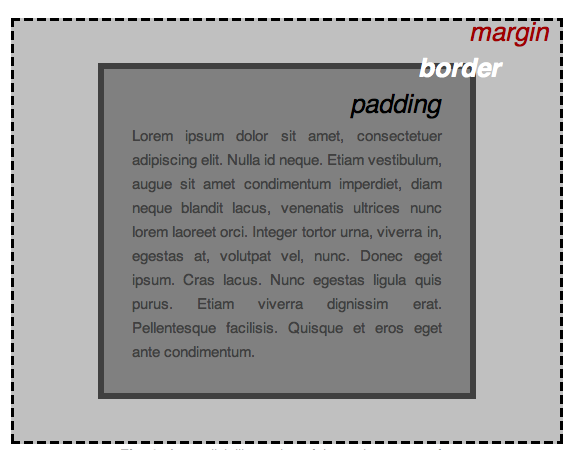
Image Source: https://developer.mozilla.org/en-US/docs/Learn/Getting_started_with_the_web/CSS_basics
Note: Style order
When you just use a single value, it is applied to the top, right, bottom and left side of the element.
.element {
    margin: 10px;
}
You can define these individually using -top, -right, -bottom, and -left suffixes:
.element {
    margin-top: 10px;
    margin-right: 15px;
    margin-bottom: 20px;
    margin-left: 25px;
}
Or there is a shorthand if you want to type it more quickly. The styles are applied in the order top, right, bottom and left.
.element {
    margin: 10px 15px 20px 25px;
}
Further examples of this are shown below.
Border
The border property defines the appearance of the box around the element. By default this is invisible, but you can give an element a visible border.
There are a few border styles that can be set, for example:
.element {
    border-style: solid;
    border-width: 1px;
    border-color: black;
    border-radius: 5px;
}
Here are the options for each of these properties:
border-style
The border style defines how the border should be drawn:
.element {
    border-style: solid;
}
The options are:
- dotted
- dashed
- solid
- double
- groove
- ridge
- inset
- outset
- none
border-width
border-width specifies the stroke width of the border:
.element {
    border-width: 1px;
}
border-color
border-color specifies the colour of the borders:
.element {
    border-color: blue;
}
border-radius
border-radius is used to create rounded corners:
.element {
    border-radius: 5px;
}
If you wanted to create a circle:
.element {
    border-radius: 50%;
}
border shorthand
It is possible to specify the border properties in a condensed form with the border property.
border: 3px solid blue;
Padding
The padding property defines spacing inside the border:
/* apply to all sides */
padding: 20px;

/* apply to individual sides */
padding-top: 50px;
padding-right: 30px;
padding-bottom: 10px;
padding-left: 80px;

/* apply to individual sides - shorthand version */
padding: 50px 30px 10px 80px;
Margin
The margin property defines spacing outside the border:
/* apply to all sides */
margin: 20px;

/* apply to individual sides */
margin-top: 50px;
margin-right: 30px;
margin-bottom: 10px;
margin-left: 80px;

/* apply to individual sides - shorthand version */
margin: 50px 30px 10px 80px;
centre-aligning content using a margin
There is a special auto value for margin that can be used to horizontally centre content.
This is usually used in combination with a width property to restrict the width of the content, so that it can be centred:
.element {
    margin-left: auto;
    margin-right: auto;
    width: 50%;
}
Exercise - borders, padding and margins
- create a new HTML file - box.html
- create a new CSS file - box.css
- In the new HTML file, copy and paste the following content:
  <!doctype html>
<html>
    <head>
        <meta charset="utf-8" />
        <title>Border/margin/padding styles</title>
        <link rel="stylesheet" href="box.css" />
    </head>
    <body>

        <h1>Border/margin/padding styles</h1>

        <h2>Border styles</h2>
        <p class="border-1">Border 1</p>
        <p class="border-2">Border 2</p>

        <h2>Border-radius styles</h2>
        <p class="border-radius-1">Border radius 1</p>
        <p class="border-radius-2">Border radius 2</p>

        <h2>Margin styles</h2>
        <p class="margin-1">Margin 1</p>
        <p class="margin-2">Margin 2</p>

        <h2>Padding styles</h2>
        <p class="padding-1">Padding 1</p>
        <p class="padding-2">Padding 2</p>

        <h2>Centre-aligning content</h2>
        <p class="centre">Is this centred?</p>
    </body>
</html>
- Set up some default styles in the the CSS file:
h2 {
    margin-bottom: 50px;
}

/* some default styles for every paragraph - may be overridden below */
p {
    margin-bottom: 20px;
    padding: 20px;
    border: 1px solid black;
}

/* borders */

.border-1 {
}
.border-2 {
}

/* border-radius */

.border-radius-1 {
}
.border-radius-2 {
}

/* margin */

.margin-1 {
}
.margin-2 {
}

/* padding */

.padding-1 {
}
.padding-2 {
}

/* centre-aligned content */

.centre {
}
Exercises
-
Add some styles for each of the
border,paddingandmarginexamples above, using some of the styles we just looked at. -
Add
width: 50%;to the.centreelement, and centre it using marginauto -
Add some text styles - change the font, colour, size etc.
(Don’t worry, the result might not look very good but it’s useful to learn!)
Tip: Remember you can use “Inspect element” in your browser to check that the styles you are adding are displaying as intended. If not, it may show you which styles are defined incorrectly, for example with a spelling mistake.
If you get stuck you can look at the example answer:
Exercise: Further practice
Here are some more exercises you could complete.
-
Try adding styles that use the
:hoverpseudo-selector to make the styling of an HTML element change when a user hovers their mouse cursor over that element. -
Create new files -
descendent-selector.htmlanddescendent-selector.css.In the HTML file, add the following:
 <!doctype html>
 <html>
     <head>
         <meta charset="utf-8" />
         <title>Descendent selectors</title>
         <link rel="stylesheet" href="descendent-selector.css" />
     </head>
     <body>
         <p class="earth">
             This is the planet <em>Earth</em>
         </p>

         <p class="mars">
             This is the planet <em>Mars</em>
         </p>
     </body>
 </html>
Try adding CSS styles that only style the
<em>element within the<p class="earth">element, and other styles that only style the<em>element within the<p class="mars">element -
Create an example HTML page that contains elements styled with the following values:
- Units defined with both
pxand% - Colours defined with keywords, hex and rgb
- Backgrounds defined with
background-color,background-image,background-sizeandbackground-position. - A background gradient
- Learn about more CSS properties and their values. Try using some of the following CSS properties:
HTML elements and page layout
When we create a website layout, we often want to define different parts of the page.
Common parts of a website might be:
- Header
- Navigation
- Main content
- Section/Article
- Sidebar/Aside
- Footer
An example of how this might look on a typical website:
Header Article
HTML elements
There are several HTML elements that can be used like invisible boxes for organising a page layout into these blocks.
These tags can be used for specific purposes:
<header><nav><main><article><aside><footer>
They don’t have any default styles, but they have semantic meaning and so they help to structure and describe content.
<!doctype html>
<html>
<head>…</head>
<body>
<header>Header</header>
<nav>Nav</nav>
<main>
<article>Article</article>
<aside>Aside</aside>
</main>
<footer>Footer</footer>
</body>
</html>
We’ll start to use these elements to structure our content into logical sections.
This can also make them easier to style and reference.
Generic elements - <div> and <span>
The elements we’ve seen above are useful to identify different areas of a page, but there aren’t always named HTML tags for every possible type of content we may have.
<div>
If you want to use a layout element but nothing in the above list is semantically right for your situation, you can instead use a <div>.
This is a versatile block element that doesn’t have an inherent semantic meaning or default styles, so it can be used for any purpose.
You can differentiate between multiple <div> elements in a page by adding a class attribute to each.
We’ll see examples of <div> elements later.
<span>
A <span> element is similar to a <div> in that it has no semantic meaning so can be used
The difference is that where a <div> is a block element, a <span> is inline, and so would be used where the semantic inline elements <em> and <strong> aren’t relevant.
Again, we’ll see examples of using <span> elements later.
Creating a grid with HTML and CSS
Using the semantic HTML elements introduced above, here is an example HTML page where the different parts of the page are split into their separate containers:
<!doctype html>
<html>
    <head>
        <meta charset="utf-8" />
        <title>Page layout</title>
        <link rel="stylesheet" href="page-layout.css" />
    </head>
    <body>
        <header>Header</header>
        <nav>Nav</nav>
        <main>
            <article>Article</article>
            <aside>Aside</aside>
        </main>
        <footer>Footer</footer>
    </body>
</html>
Once we have this HTML is place, we can begin to add styles.
Here are some initial styles based on what we know already. We can add some initial layout to these blocks, for example by changing their borders, margin and padding:
header,
nav,
article,
aside,
footer {
    margin-bottom: 2.5%;
    padding: 5%;
    border: 1px solid lightgray;
    text-align: center;
}
header,
footer {
    background: #efefef;
}
nav {
    padding: 1%;
}
article {
    min-height: 200px;
}
aside {
    background: #ddd;
}
This is how the code above would render in a browser:
Header Article
This looks OK for a very simple page, but if you scroll back to the top of this page, our original goal was to place the <aside> element next to the <article>, like this:
Article
To learn how to do this (and much more) we need to learn some CSS page layout techniques.
CSS page layout
There are a number of ways to create page layouts with CSS. The end result is broadly the same, but the way to implement them differs.
- HTML tables
- floats
- flexbox
- grid
The first recognised way to create page layouts was using HTML tables. For many years now this technique has been discouraged, as it doesn’t separate content (HTML) from style (CSS). If you find a tutorial suggesting this method it should be avoided.
The first CSS-based layout method was using floats. This achieved the separation of content (HTML) from style (CSS), although it could be quite a confusing system to implement, with strange rendering quirks. You may find plenty of tutorials recommending floats. Although it would be OK to use them, there are more modern approaches, and so again should generally be avoided.
Flexbox
Flexbox is the first of two modern techniques for creating page layouts, and the one we are going to focus on here.
There is one very important point to remember when using flexbox:
Flexbox works by specifying the layout out of inner elements within an outer container.
You’ll see examples of this shortly.
On the container, the following line of CSS needs to be added:
display: flex;
There are some different CSS properties and values that you can use on the inner elements, depending on the layout that is required. Some examples are given below.
Flexbox, two columns with equal spacing
With the following HTML:
<div class="container">
    <div class="column">Column 1</div>
    <div class="column">Column 2</div>
</div>
To make the two columns sit side-by-side you would add the following CSS:
.container {
    display: flex;
}
.column {
    flex: 1;
}
This would result in two columns of equal width:
Column 1Column 2
Flexbox, three columns with equal spacing
With the following HTML:
<div class="container">
    <div class="column">Column 1</div>
    <div class="column">Column 2</div>
    <div class="column">Column 3</div>
</div>
To make the three columns sit side-by-side you would use exactly the same CSS:
.container {
    display: flex;
}
.column {
    flex: 1;
}
The same CSS as the first example, but an extra HTML element - this would result in three columns of equal width:
Column 1Column 2Column 3
Flexbox, two columns, one 75% width, one 25% width
If you want columns of different widths, you’ll need to give them a different class so you can apply different styles for each.
With the following HTML:
<div class="container">
    <div class="column-one">Column 1</div>
    <div class="column-two">Column 2 - Lorem ipsum dolor sit amet...</div>
</div>
To make the first column 25% width and the second column 75% width you would add the following CSS:
.container {
    display: flex;
}
.column-one {
    flex: 1;
}
.column-two {
    flex: 3;
}
This would result in the second column having three times the width of the first column, and note they have equal heights:
Column 1Column 2 - Lorem ipsum dolor sit amet aliqua sunt proident aute Lorem magna do ipsum elit fugiat labore culpa consequat. Laborum est pariatur aute dolor cupidatat et sunt occaecat voluptate. Duis pariatur laborum fugiat laborum cillum nisi commodo ad. Anim tempor adipisicing enim cillum commodo officia sit veniam deserunt nostrud eiusmod qui. Cupidatat labore enim aliqua in. Incididunt ea ea labore amet commodo. Sunt ea dolor irure cupidatat ipsum anim voluptate. Ullamco ex enim irure laborum est ea.
Flexbox, lots of blocks wrapping
When you have lots of HTML elements:
<div class="container">
    <div class="column">1</div>
    <div class="column">2</div>
    <div class="column">3</div>
    <div class="column">4</div>
    <div class="column">5</div>
    <div class="column">6</div>
    <div class="column">7</div>
    <div class="column">8</div>
    <div class="column">9</div>
    <div class="column">10</div>
    <div class="column">11</div>
    <div class="column">12</div>
</div>
By default, when you set display: flex on a container, all child elements will sit on a single line:
.container {
    display: flex;
}

.column {
    flex: 1;
}
This would result in:
123456789101112
If we want these child elements to wrap onto the next line we need to add flex-wrap: wrap to our css - I’ll also add an arbitrary width so they are a bit wider to demonstrate this a little better - note that I have removed the flex value from the .column selector too:
.container {
    display: flex;
    flex-wrap: wrap;
}

.column {
    width: 250px;
}
This would result in:
123456789101112
Gaps between columns
If you want to add a gap between columns you can add a gap to the container styles.
With the following HTML:
<div class="container">
    <div class="column-one">Column 1</div>
    <div class="column-two">Column 2 - Lorem ipsum dolor sit amet...</div>
</div>
Let’s add a gap of 20px between the columns:
.container {
    display: flex;
    gap: 20px;
}
.column-one {
    flex: 1;
}
.column-two {
    flex: 3;
}
This would result in:
Column 1Column 2 - Lorem ipsum dolor sit amet aliqua sunt proident aute Lorem magna do ipsum elit fugiat labore culpa consequat. Laborum est pariatur aute dolor cupidatat et sunt occaecat voluptate. Duis pariatur laborum fugiat laborum cillum nisi commodo ad. Anim tempor adipisicing enim cillum commodo officia sit veniam deserunt nostrud eiusmod qui. Cupidatat labore enim aliqua in. Incididunt ea ea labore amet commodo. Sunt ea dolor irure cupidatat ipsum anim voluptate. Ullamco ex enim irure laborum est ea.
This gap applies between columns and rows, you can define them separately using column-gap and row-gap, e.g.:
.container {
    display: flex;
    column-gap: 20px;
    row-gap: 50px;
}
Further reading:
- https://internetingishard.netlify.app/html-and-css/flexbox/
- https://developer.mozilla.org/en-US/docs/Learn/CSS/CSS_layout/Introduction
- https://developer.mozilla.org/en-US/docs/Learn/CSS/CSS_layout/Flexbox
- https://developer.mozilla.org/en-US/docs/Web/CSS/CSS_Flexible_Box_Layout/Basic_Concepts_of_Flexbox
Also, a fun way to learn all of the options available with flexbox is with Flexbox Froggy and Flexbox labs
Exercise - even column width layout
First, we’ll try making a page that has columns of even width.
In your index.html file add a link to this new exercise:
<ul>
    <li>
        <a href="./even-columns.html">Even columns</a>
    </li>
</ul>
Then, create new html and css files:
even-columns.htmleven-columns.css
Add some HTML to even-columns.html:
<!doctype html>
<html>
    <head>
        <meta charset="utf-8" />
        <title>Page layout: Even columns</title>
        <link rel="stylesheet" href="even-columns.css" />
    </head>
    <body>
        <p><a href="./">Back to the home page</a></p>
        <h1>Page layout: Even columns</h1>


    </body>
</html>
First, we need to add the HTML that we want to place into columns of even widths:
<div class="container">
    <div class="column">Column 1</div>
    <div class="column">Column 2</div>
</div>
We will also need some styles that make it easy to see our columns:
.column {
    background: rgb(200 200 200 / 0.6);
    outline: 1px solid #999;
    padding: 10px;
}
Open this in a web browser, you should see the columns in a ‘linear’ layout, one above the other.
To place them side-by-side, we need to add the flexbox styles we have just learned about:
.container {
    display: flex;
}
.column {
    flex: 1;
}
Refresh the page, does it work as expected?
Try adding a third column to the HTML, immediately after the first two (inside the container):
<div class="column">Column 3</div>
Refresh the page again, does this make the page three equal columns?
Try adding a gap to the container to add a space betwen the columns:
.container {
    gap: 20px;
}
If you get stuck you can see examples here:
Exercise - different column width layout
Next, we’ll try making a page that has columns of different widths.
First, add a link to this new exercise to your home page:
<li>
    <a href="./different-columns.html">Different columns</a>
</li>
Then create new html and css files:
different-columns.htmldifferent-columns.css
Add some HTML to different-columns.html:
<!doctype html>
<html>
    <head>
        <meta charset="utf-8" />
        <title>Page layout: different columns</title>
        <link rel="stylesheet" href="different-columns.css" />
    </head>
    <body>
        <p><a href="./">Back to the home page</a></p>
        <h1>Page layout: different columns</h1>


    </body>
</html>
First, we need to add the HTML that we want to place into columns of different widths:
<div class="container">
    <div class="column column-one">Column 1</div>
    <div class="column column-two">Column 2</div>
</div>
We will also need some styles that make it easy to see our columns:
.column {
    background: rgb(200 200 200 / 0.6);
    outline: 1px solid #999;
    padding: 10px;
}
Open this in a web browser, you should see the columns in a ‘linear’ layout, one above the other.
To place them side-by-side, we need to add the flexbox styles we have just learned about:
.container {
    display: flex;
}
.column-one {
    flex: 3;
}
.column-two {
    flex: 1;
}
Refresh the page, does it work as expected?
Try adjusting the flex amounts to see how this affects the layout.
If you get stuck you can see examples here:
Exercise - wrapped content
Next, we’ll try making a page that has columns that wrap across multiple lines.
First, add a link to this new exercise to your home page:
<li>
    <a href="./wrapped-content.html">Wrapped content</a>
</li>
Then create new html and css files:
wrapped-content.htmlwrapped-content.css
Add some HTML to wrapped-content.html:
<!doctype html>
<html>
    <head>
        <meta charset="utf-8" />
        <title>Page layout: wrapped content</title>
        <link rel="stylesheet" href="wrapped-content.css" />
    </head>
    <body>
        <p><a href="./">Back to the home page</a></p>
        <h1>Page layout: wrapped content</h1>


    </body>
</html>
First, we need to add the HTML that we want to place into columns:
<div class="container">
    <div class="column">Column 1</div>
    <div class="column">Column 2</div>
    <div class="column">Column 3</div>
    <div class="column">Column 4</div>
    <div class="column">Column 5</div>
    <div class="column">Column 6</div>
    <div class="column">Column 7</div>
    <div class="column">Column 8</div>
    <div class="column">Column 9</div>
    <div class="column">Column 10</div>
    <div class="column">Column 11</div>
    <div class="column">Column 12</div>
</div>
We will also need some styles that make it easy to see our columns:
.column {
    background: rgb(200 200 200 / 0.6);
    outline: 1px solid #999;
    padding: 10px;
}
Open this in a web browser, you should see the columns in a ‘linear’ layout, one above the other.
To place them side-by-side and wrap them, we need to add the flexbox styles we have just learned about:
.container {
    display: flex;
    flex-wrap: wrap;
}

.column {
    width: 250px;
}
Refresh the page, does it work as expected?
Try adding a gap using column-gap and row-gap, e.g.:
.container {
    column-gap: 20px;
    row-gap: 50px;
}
Try adjusting the width of the columns to see how this affects the layout.
One thing to note here is that the widths of the columns are the width you have specified above plus the padding.
You might want to add this to the top of your CSS:
* {
    box-sizing: border-box;
}
Here’s an explanation of what this does:
It stops the padding value being added to the width value, which you may not have realised is the default behaviour for CSS.
If you get stuck you can see examples here:
Content alignment with align-items and justify-content
The examples above are useful when you want to create columns for your content.
We can also use CSS for other types of page layout, such as positioning content within a header, footer or main content area.
Flexbox is useful for aligning content both vertically and horizontally, using a combination of the properties align-items and justify-content.
Here’s an example layout that becomes possible with flexbox, a header block that has a left-aligned logo, a right-aligned navigation menu, both aligned vertically at the centre:
Logo
We’ll look at the code that allows us to create this layout.
Each of the following examples assume we have the following HTML:
<div class="container">
    <div class="logo">Logo</div>
    <ul class="nav">
        <li class="nav-item">
            <a href="#">Home</a>
        </li>
        <li class="nav-item">
            <a href="#">About</a>
        </li>
        <li class="nav-item">
            <a href="#">Contact</a>
        </li>
    </ul>
</div>
We also have a few styles that don’t affect the layout but just make the content a little nicer:
.container {
    border: 10px solid #036;
    padding: 10px;
}
.logo {
    width: 100px;
    height: 100px;
    background: #f90;
    border-radius: 50%;

    /* these three styles centre the text in the logo */
    display: flex;
    align-items: center;
    justify-content: center;
}
.nav {
    list-style: none;
    margin: 0;

    /* this places the nav items on the same row */
    display: flex;
}
.nav-item {
    margin: 2px;
    padding: 10px;
    background: rgba(255 128 0 / 0.2);
}
align-items for vertical alignment
To change the vertical alignment of elements within a flexbox, we use the align-items property.
There are four possible values that will be useful for us.
flex-start for top alignment
.container {
    display: flex;
    align-items: flex-start;
}
This aligns the content to the top of the container:
Logo
flex-end for bottom alignment
.container {
    display: flex;
    align-items: flex-end;
}
This aligns the content to the bottom of the container:
Logo
center for centre alignment
.container {
    display: flex;
    align-items: center;
}
This aligns the content to the centre of the container:
Logo
stretch to fill the available space
.container {
    display: flex;
    align-items: stretch;
}
This stretches the content to fill the available space:
Logo
justify-content for horizontal alignment
To change the horizontal alignment of elements within a flexbox, we use the justify-content property.
There are several possible values that will be useful for us.
flex-start for left alignment
.container {
    display: flex;
    justify-content: flex-start;
}
This aligns the content to the left of the container:
Logo
flex-end for right alignment
.container {
    display: flex;
    justify-content: flex-end;
}
This aligns the content to the right of the container:
Logo
center for centre alignment
.container {
    display: flex;
    justify-content: center;
}
This aligns the content to the centre of the container:
Logo
space-around for evenly-spaced content
.container {
    display: flex;
    justify-content: space-around;
}
This aligns the content evenly, so all available is space is placed around and between each element:
Logo
space-between for content spaced to the edges
.container {
    display: flex;
    justify-content: space-between;
}
This aligns the content so all available is space is placed between the elements:
Logo
Exercise - content alignment
Let’s create an example page that uses both align-items and justify-content.
First, add a link to this new exercise to your home page:
<li>
    <a href="./content-alignment.html">Content alignment</a>
</li>
Create new html and css files:
content-alignment.htmlcontent-alignment.css
We’ll use the example HTML and CSS that we saw above.
Here is the HTML:
<!doctype html>
<html>
    <head>
        <meta charset="utf-8" />
        <title>Page layout: Content alignment</title>
        <link rel="stylesheet" href="content-alignment.css" />
    </head>
    <body>
        <p><a href="./">Back to the home page</a></p>
        <h1>Page layout: Content alignment</h1>

        <div class="container">
            <div class="logo">Logo</div>
            <ul class="nav">
                <li class="nav-item">
                    <a href="#">Home</a>
                </li>
                <li class="nav-item">
                    <a href="#">About</a>
                </li>
                <li class="nav-item">
                    <a href="#">Contact</a>
                </li>
            </ul>
        </div>
    </body>
</html>
And here is the CSS:
.container {
    border: 10px solid #036;
    padding: 10px;

    /* we'll add some more styles here shortly */
}
.logo {
    width: 100px;
    height: 100px;
    background: #f90;
    border-radius: 50%;

    /* these three styles centre the text in the logo */
    display: flex;
    align-items: center;
    justify-content: center;
}
.nav {
    list-style: none;
    margin: 0;

    /* this places the nav items on the same row */
    display: flex;
}
.nav-item {
    margin: 2px;
    padding: 10px;
    background: rgba(255 128 0 / 0.2);
}
Set alignment values
First, we need to add flexbox layout to the container element:
.container {
    /* add the following line below the existing styles */
    display: flex;
}
Next, pick a value for align-items and a value for justify-content from the examples above and add these to the container styles. See if you can come up with your preferred layout.
If you get stuck you can see examples here:
Exercise - full page layout
Now we’re going to put together everything we have learned so far today to create a full page layout with HTML and CSS.
When you have finished, you should have a page that looks like this:
First, add a link to this new exercise to your home page:
<li>
    <a href="./page-layout-full.html">Page layout</a>
</li>
Create new html and css files:
page-layout-full.htmlpage-layout-full.css
Add some HTML to page-layout-full.html:
<!doctype html>
<html>
<head>
<meta charset="utf-8" />
<title>Planets of the solar system</title>
<link rel="stylesheet" href="page-layout-full.css" />
</head>
<body>
<header>
<h1>Planets of the solar system</h1>
</header>
<nav>
<ul class="navigation">
<li class="navigation-item">
<a class="navigation-link" href="#">
First link
</a>
</li>
<li class="navigation-item">
<a class="navigation-link" href="#">
Second link
</a>
</li>
<li class="navigation-item">
<a class="navigation-link" href="#">
Third link
</a>
</li>
</ul>
</nav>
<main>
<article>
<h2>Here are some planets</h2>
<ul class="planets">
<li class="planet">Mercury</li>
<li class="planet">Venus</li>
<li class="planet">Earth</li>
<li class="planet">Mars</li>
<li class="planet">Jupiter</li>
<li class="planet">Saturn</li>
<li class="planet">Uranus</li>
<li class="planet">Neptune</li>
</ul>
</article>
<aside>
<p>Aside</p>
</aside>
</main>
<footer>
© Some rights reserved
</footer>
</body>
</html>
And some CSS:
* {
    box-sizing: border-box;
}

header,
nav,
article,
aside,
footer {
    margin-bottom: 2.5%;
    padding: 5%;
    border: 1px solid lightgray;
    text-align: center;
}
header,
footer {
    background: #efefef;
}
nav {
    padding: 0;
}
main {
    /* you'll add some styles here shortly */
}
article {
    /* you'll add some styles here shortly */
}
aside {
    background: #ddd;
}

.planets {
    margin: 0;
    padding: 0;
}

.planet {
    list-style: none;
    border: 2px solid black;
    border-radius: 50%;
    height: 200px;
    width: 200px;
    padding: 10px;
    margin: 10px;
}
Preview the HTML in a new web browser tab to make sure it’s all set up correctly.
There are three updates to make to this based on the flexbox techniques we’ve just learned:
Step one: Align the <article> and <aside> elements side-by-side
In the CSS, find where the styles for the main element will go, and add display: flex:
main {
    display: flex; /* add this line */
}
Then add a flex value for the article and aside:
article {
    flex: 3; /* add this line */
}
aside {
    background: #ddd;
    flex: 1; /* add this line */
}
Complete those changes and refresh the page in the browser.
Are the article and aside elements now side-by-side?
If you want to add some space between the columns, you can use gap:
main {
    display: flex;
    gap: 20px; /* add this line */
}
Step two: Align the planets, a few on each line
In the CSS, set the flex property on the .planets element:
.planets {
    /* add these lines */
    display: flex;
    flex-wrap: wrap;
    justify-content: space-around;
}
Complete those changes and refresh the page in the browser.
Are the planets now displayed in several rows?
Step three: Make the navigation look like navigation
In the CSS, set similar flex properties on the .navigation element:
.navigation {
    display: flex;
    list-style: none;
    margin: 0;
    padding: 0;
}
Ensure the navigation items fill the available space:
.navigation-item {
    flex: 1;
}
You can also style the actual links:
.navigation-link {
    background: orange;
    color: white;
    display: block;
    padding: 20px;
}
And also try adding :hover styles:
.navigation-link:hover {
    background: green;
    color: yellow;
    text-decoration: none;
}
If you get stuck, example files can be found here:
Responsive design
The last exercise works well enough when displayed on a laptop or desktop machine, but what happens when we try to open it on a device with a lower resolution - for example a phone?
Try opening it in a web browser and then reduce the width of your browser until it’s as narrow as a typical mobile.
We set several elements to sit next to one another on the page. But it doesn’t work very well when screen width is limited.
There is a way to specify styles that should only be applied for certain screen resolutions. We need to use media queries, applying a layout technique that is known as responsive design.
Media queries
A media query is a piece of CSS that applies styles only when specific conditions are met.
They are most commonly used to apply styles for certain browser dimensions.
We create a media query by surrounding our CSS styles by an extra piece of CSS that states which conditions (such as a minimum page width) need to be met before the styles should be applied:
/*
 * any styles set here will only be applied
 * if the page width is 600px or more
 */
@media (min-width: 600px) {
    .element {
        ...
    }
}
For example, if we had the following HTML:
<div class="content">
    <div class="narrow">
        <h1>Narrow content</h1>
    </div>
    <div class="wide">
        <h1>Wide content</h1>
    </div>
</div>
And this CSS:
/* these are the default styles for every browser  */
.content {
    background: red;
}

.wide {
    display: none;
}

/* these styles are applied for browsers wider than 600px */
@media (min-width: 600px) {
    .content {
        background: green;
    }
    .narrow {
        display: none;
    }
    .wide {
        display: block;
    }
}
Here is an example page using the code above, to demonstrate how these styles are applied as the browser width changes.
This isn’t a very useful example, but it does at least demonstrate how we might apply different styles for browsers at different resolutions.
We can use the same technique - a @media query - to create a more useful example, only applying flexbox styles above a certain width.
We’ll see an example of this shortly.
Mobile first
The best-practice approach for creating a responsive design is to design Mobile-first - that is, to start with basic mobile styles, and add extra layout such as columns at higher resolutions.
We’ll use this principle when adding all of our responsive styles, which will all use min-width to determine whether styles should be applied.
Meta viewport
In order to make web pages appear as expected in our mobile devices, we need to add one more meta tag to our HTML:
<meta name="viewport" content="width=device-width, initial-scale=1" />
From now on, in every web page we build, we’ll include this in the <head> of our document.
Further information on this can be found here:
Exercise
We’ll create a responsive design, and only apply the flexbox above a certain page width.
Add a new link to your home page:
    <li>
        <a href="./media-query.html">Media query</a>
    </li>
Next, create new html and css files:
media-query.htmlmedia-query.css
Add some HTML:
<!doctype html>
<html>
    <head>
        <meta charset="utf-8" />
        <meta name="viewport" content="width=device-width, initial-scale=1">
        <title>Planets of the solar system</title>
        <link rel="stylesheet" href="media-query.css" />
    </head>
    <body>
        <main>
            <article>
               <h2>Here are some planets</h2>
               <ul class="planets">
                    <li class="planet">Mercury</li>
                    <li class="planet">Venus</li>
                    <li class="planet">Earth</li>
                    <li class="planet">Mars</li>
                    <li class="planet">Jupiter</li>
                    <li class="planet">Saturn</li>
                    <li class="planet">Uranus</li>
                    <li class="planet">Neptune</li>
                </ul>
            </article>
            <aside>
                <p>Aside</p>
            </aside>
        </main>
    </body>
</html>
And add some CSS:
* {
    box-sizing: border-box;
}

article,
aside {
    margin-bottom: 2.5%;
    padding: 5%;
    border: 1px solid lightgray;
    text-align: center;
}
aside {
    background: #ddd;
}

/* planets */

.planets {
    margin: 0;
    padding: 0;
}

.planet {
    list-style: none;
    border: 2px solid black;
    border-radius: 50%;
    height: 200px;
    width: 200px;
    margin-bottom: 20px;
    margin-left: auto;
    margin-right: auto;
    padding: 10px;
}
Open the HTML page in a web browser.
These are reasonable CSS styles for a mobile layout - now we want to add styles to make it look a little better in a wider desktop/laptop browser.
For the following examples you can choose any minimum width you wish, but for this example let’s pick 900px.
Creating columns
For mobile browsers, we don’t have room to put the article and aside side-by-side so they are stacked one above the other.
For browsers that are wide enough, we can place the two side-by-side.
We learned how to do this earlier, but using flexbox.
Add the following to create the main columns:
@media (min-width: 900px) {
    main {
        display: flex;
    }
    article {
        flex: 3;
    }
    aside {
        flex: 1;
    }
}
This can sit anywhere in your CSS, but it may be a good idea to place it immediately underneath the styles for article and aside.
Creating rows
For mobile browsers, we have a single column of planets, one per line.
For wider browsers, rather than having a single column of planets, we can put more than one on a single row.
Add the following at the bottom of the stylesheet:
@media (min-width: 900px) {
    .planets {
        display: flex;
        flex-wrap: wrap;
        justify-content: space-around;
    }

    .planet {
        margin-left: 20px;
        margin-right: 20px;
    }
}
This should work well. In fact, we can go further and add a second media query at an even greater width so that we can make our planets larger.
Add the following:
@media (min-width: 1200px) {
    .planet {
        width: 300px;
        height: 300px;
     }
}
If you get stuck, example files can be found here:
Fluid, fixed and hybrid grid layouts
We could think of the last two examples as fluid grid layouts, as they expand to fill the available browser width. If you resize your browser window, the columns will expand or contract to fill the entire available space.
The original Responsive Web Design article has a good example of this type of layout - resize your browser window to see the three different layouts at different resolutions, each of which expands to fill the entire browser window.
To turn a fluid grid into a fixed grid, we can use the same set of styles, and then simply apply a set width to the parent container to constrain it.
An example of this below assumes we have an element with a class of container surrounding our HTML element:
<!doctype html>
<html>
    <head>
        ...(head content)...
    </head>
    <body>
        <div class="container">
            ...(body content)...
        </div>
    </body>
</html>
To create a fixed grid when our browser width is above a certain size, we set one or more fixed content widths for our container at predefined sizes:
@media (min-width: 800px) {
    .container {
        width: 800px;
        margin-left: auto;
        margin-right: auto;
    }
}

@media (min-width: 1200px) {
    .container {
        width: 1200px;
    }
}
This would fix the overall width of the content, meaning the layout will ‘jump’ from one layout to the next at each breakpoint rather than always scaling to fill the full width as we resize our browser.
This follows a common pattern that uses a fluid grid for smaller screen sizes (for example mobile devices), and then set one or more fixed dimensions for larger screens to turn the fluid grid into a fixed grid.
This hybrid grid layout technique can be found on many websites, such as the BBC News and The Guardian
Exercise: Further practice
Here is another exercise you could complete.
-
We want to take the page we made above: page-layout-full.html
And make this layout work for mobile: hybrid-grid.html
There are two changes we should make:
- Only put the main content into columns above a certain width
- Create a hybrid grid, so the page snaps to a fixed width
Create two new files -
hybrid-grid.htmlandhybrid-grid.cssCopy and paste the HTML and CSS from
page-layout-full.htmlandpage-layout-full.cssfiles you made earlier.You’ll need to change in your HTML is the CSS file that it is importing:
<link rel="stylesheet" href="hybrid-grid.css" />First, remove the columns for mobile by locating the following style:
main {
     display: flex;
}
We only want to apply this style above a set size:
@media (min-width: 800px) {
     main {
         display: flex;
     }
}
We also want to apply a fixed width to the page, so add a
<div class="container">around all content inside the<body>and then apply the following styles to it:@media (min-width: 800px) { .container { width: 800px; margin-left: auto; margin-right: auto; } } @media (min-width: 1200px) { .container { width: 1200px; } }If you get stuck you can see a working version here:
-
Try to recreate the ‘nested display flex’ example above.
-
Try adding the HTML structural elements to your home page
-
Put each set of exercises inside a
<div>element and turn them into columns
CSS positioning
We can use flexbox for almost all page layouts, but sometimes there are things we may want to do that aren’t possible with flexbox alone.
There are occasions when you may want to do something a little different, such as position an element over another, fix the position of an element in the browser window, or make a navigation bar ‘sticky’.
To achieve this, you would use the CSS position declaration, together with one or more related styles.
You can learn more about this here:
Related styles
top, bottom, left and right
When setting a position value on an element, it doesn’t have much effect until you also tell the element where you would like it to be positioned, which is usually a combination of one or more of these values:
topbottomleftright
You may also want to set a width and/or height on the element, depending on how you are using it. You will see examples of this below.
z-index
When set, the z-index value controls which elements should sit above others.
The higher the value, the higher that the element will sit above others.
This property has no effect on its own, unless one of the four values for position have also been specified on an HTML element.
relative and absolute positioning
If you want to position an element above another element, you need to use relative and absolute positioning.
When the position of an element is set to absolute, it is taken out of the flow of the document, meaning all other elements behave as if it’s not there.
Here’s an example of this in action:
This is absolutely positioned to the bottom of the container
Here is the HTML for the example above:
<div class="container">
    <div class="text">This is absolutely positioned to the bottom of the container</div>
</div>
And the CSS:
.container {
    position: relative;
    background-image: url(./images/earth.jpg);
    background-size: cover;
    min-height: 300px;
}

.text {
    position: absolute;
    bottom: 0;
    left: 0;
    right: 0;
    z-index: 1;
    background: rgb(255 255 255 / 0.6);
    color: #036;
    padding: 20px;
    font-size: 24px;
    text-align: center;
}
fixed positioning
If you want to fix the position of an HTML element somewhere in a browser window, regardless of how much a user scrolls, you can used fixed positioning.
It works a little like elements that have an absolute position except they are unaffected by the page scrolling.
Common uses for this technique include placing a ‘help’, ‘add’ or ‘chat’ icon in a bottom corner of a screen.
.element {
    position: fixed;
    bottom: 10px;
    right: 10px;
    z-index: 50;
}
We’ll see an example of this shortly.
sticky positioning
Elements that have a sticky position will sit in their natural place in the document until they are scrolled offscreen, at which point they fix themselves to part of the screen.
This is commonly used for navigation bars that remain at the top of a browser window when a user scrolls down a page.
.element {
    position: sticky;
    top: 0;
    z-index: 50;
}
We’ll see an example of this shortly.
Exercise - positioning
We’re going to take the last ‘page layout’ example we created earlier, and we’re going to add a fixed element and a sticky element.
First, add a link to your home page:
<li>
    <a href="./position.html">Position</a>
</li>
Create a new file called position.html and copy and paste the content from your file called page-layout-full.html.
Then, create a new file called position.css and copy and paste the content from your file called page-layout-full.css.
Then, you’ll need to edit position.html and update the name of the CSS file that it references to the one you just created:
<link rel="stylesheet" href="position.css" />
Open this page in a web browser.
Set the <nav> element to sticky
Let’s make the <nav> element sticky, so that it stays at the top of the browser window when you scroll down the page.
Add the following styles to the bottom of the CSS file:
nav {
    position: sticky;
    top: 0;
}
Open the page in a web browser, does it work as expected?
Set the <footer> element to fixed
Let’s fix the <footer> element to the bottom of the screen.
Add the following styles to the bottom of the CSS file:
footer {
    position: fixed;
    bottom: 0;
    left: 0;
    right: 0;
    margin: 0;
}
Refresh the page in the browser window. Does it work?
You can play around with these styles to change how they are positioned.
If you get stuck, take a look at the following example:
Nested display: flex
Earlier we saw an example of display: flex which allowed us to create page layouts.
One thing we didn’t explore further was the concept of ‘nesting’ flex content, or using a flex layout within another flex layout.
This is useful for many reasons, such as when you wanted to position content in the centre of other content.
Here are three example pages. The first is an example layout that is using flex, the second is example content that is also using flex, and then the third example with the two combined into a single page:
In the third example above, we have two levels of nested display: flex; content.
When you look at the HTML and CSS for this page it may at first look confusing, and so it’s useful to look at one level at a time.
<article> and <aside> within <main>
This is the first use of display: flex, which gives us our two columns of content:
<main>
    <article>...</article>
    <aside>...</aside>
</main>
Note that this CSS is defined with a media query that means it only takes effect if the browser width is large enough:
@media (min-width: 900px) {
    main {
        display: flex;
    }
    article {
        flex: 4;
    }
    aside {
        flex: 1;
    }
}
<div class="planet"> within <div class="planets">
Within the <article> above we define a planets element, which contains multiple planet elements:
<article>
    <div class="planets">
        <div class="planet">
            <a href="#" class="planet-link">
                <img class="planet-image" src="..." />
                <p class="planet-name">Mercury</p>
                <p class="planet-details">...</p>
            </a>
        </div>
    </div>
</article>
The following CSS ensures each block will be aligned and an equal width:
.planets {
    display: flex;
    flex-wrap: wrap;
    align-items: center;
    justify-content: center;
    text-align: center;
}

.planet {
    width: 50%;
    padding: 20px;
}

@media (min-width: 1200px) {
    .planet {
        width: 25%;
    }
}
If you look in the CSS file below you’ll see some extra styles applied to the planet content:
.planet-link {
    color: #000;
}

.planet-link:hover {
    color: #999;
}

.planet-image {
    width: 100%;
    margin-bottom: 5px;
}

.planet-name {
    font-weight: bold;
    font-size: 20px;
    margin-top: 0;
    margin-bottom: 5px;
}

.planet-details {
    font-style: italic;
    font-size: 12px;
    margin: 0;
}
Here again is the example page that combines the code above:
Grid
Grid is an alternative technique for creating page layouts.
Like flexbox, it allows for complex page layouts to be created with CSS.
The main difference between the two is how you write the CSS to create the page layout. Grid allows for more complex two-dimensional layouts to be created, but it can be more complicated to learn because of the syntax.
The following example is taken from the Mozilla docs
Here’s the HTML:
<div class="wrapper">
    <div class="one">One</div>
    <div class="two">Two</div>
    <div class="three">Three</div>
    <div class="four">Four</div>
    <div class="five">Five</div>
    <div class="six">Six</div>
</div>
And here’s the CSS:
.wrapper {
    display: grid;
    grid-template-columns: repeat(3, 1fr);
    grid-gap: 10px;
    grid-auto-rows: minmax(100px, auto);
}
.one {
    grid-column: 1 / 3;
    grid-row: 1;
}
.two {
    grid-column: 2 / 4;
    grid-row: 1 / 3;
}
.three {
    grid-column: 1;
    grid-row: 2 / 5;
}
.four {
    grid-column: 3;
    grid-row: 3;
}
.five {
    grid-column: 2;
    grid-row: 4;
}
.six {
    grid-column: 3;
    grid-row: 4;
}
This is the resulting layout:
OneTwoThreeFourFiveSix
To learn more about grid and how it differs from flexbox you can look at the following articles:
- https://learncssgrid.com/
- https://developer.mozilla.org/en-US/docs/Web/CSS/CSS_Grid_Layout/Basic_Concepts_of_Grid_Layout